Browse all articles

Inside Trendline SEO’s Custom Approach to Web Development
See how Trendline SEO seamlessly combined Figma’s design efficiency with Webflow’s flexibility to rapidly create a scalable website foundation.

Core Service
Design & Development
Main Focus
Scalable Website Builds
Result 1
Rapid Prototyping
Result 2
Scalable Content Framework
Project overview
When we decided it was time to rebuild our own website, we saw it as far more than a simple refresh.
Our team has rebuilt websites for many different clients over the years, so we already had a proven process and tech stack in place.
This was our moment to walk the walk. We wanted to turn an empty domain into a lead-generating powerhouse and a true demonstration of our expertise in action.
But starting with a blank slate wasn’t without hurdles.
We had zero existing authority, no existing content, and it needed to be economical since we already invested heavily into our agentic content production system.
It felt ambitious, and even intimidating. But honestly? We thrive on that.
Project execution
What sets our agency apart is our ability to strategically set up campaigns from the start.
We rarely build a website without a clear strategic direction that we can use to compound ranking gains later.
It is essential not only for our sites to rank, but to also build authority around targeted buyer journeys.
The entire core of this comes through a strategic plan - a combination of competitive analysis, SEO strategy, and content calendar creation.
By the end of that first sprint, we had clarity:
- Which pages we wanted to produce on the site.
- Topic clusters mapped thoughtfully across Services, Industries, Blog, Glossary, and Courses pages.
- An intuitive internal-linking strategy funneling visitors from educational content directly toward conversion pages.
- A flat URL structure, meticulously keyword-optimized for quick indexing.
- Carefully prepared on-page briefs, with exact titles, metadata, and heading outlines, so our content team could execute flawlessly.
Watching this blueprint come alive, from Home through to the Contact page, felt like seeing the scaffolding of a skyscraper rise before our eyes.
But as we all know, great SEO alone doesn’t cut it if your website feels overwhelming or cluttered.
That's why Figma became our creative playground.
Defining a Cohesive Brand
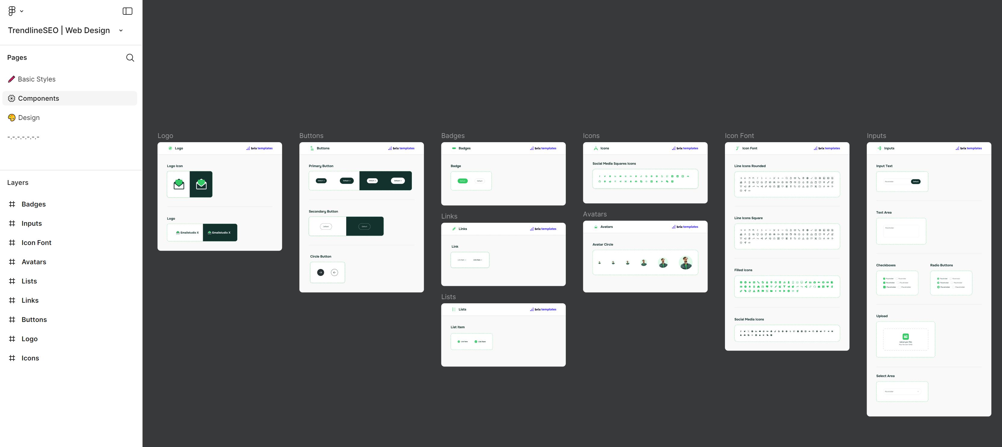
Scalability is at the core of everything we do, which is why we design comprehensive resource libraries in Figma for our custom website builds.
The goal is to design a modular design system packed with responsive components.
This approach takes time and effort up front, but once created, it saves a lot of design time and cost later.
But more importantly, creating a resource library maintains visual coherence and beauty no matter how content-heavy pages become.
The foundation of our website designs always starts with a brand kit or style guide if the client has one available.
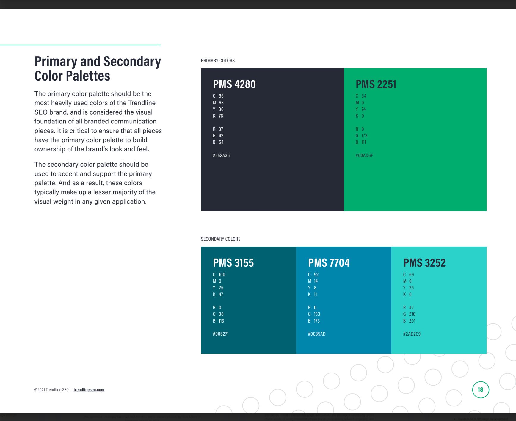
Brand guidelines such as colors, fonts, and which imagery we can use are critically important in our design work.
In our case, we knew that we wanted to focus on our primary blue and green colors and replicate the general look and feel of the rest of our marketing materials.
Our brand standards guide the first step, which is creating the components that we'll use within the rest of the site design.
We typically create a logo, buttons, badges, icons, and inputs like forms and text areas.
Once we have the general components that match the brand standards, we then start designing the site.
Bringing the Pages to Life Using Design
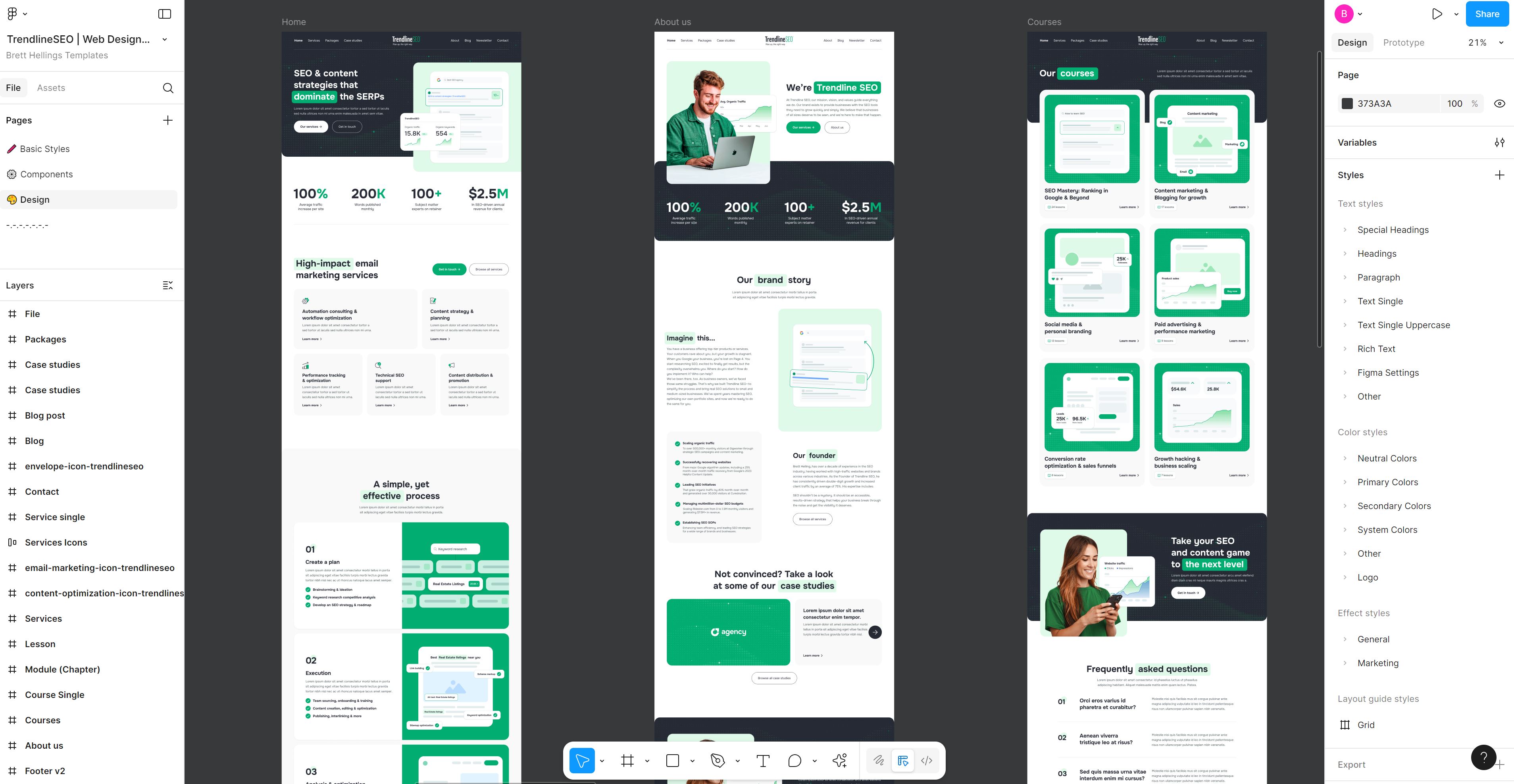
The design process we've found that works best is to start with a concept and flush it out from there.
In practice, that looks like: Receive Content > Homepage Design > Revisions > Internal Pages Design > Revisions > Webflow Development.
This entire process is most efficient if our team is also doing the branding work or if we are rebuilding an existing site. For new sites, we use placeholder text.
After we get the text nailed down, the team creates a homepage design and we iterate that until we're happy.
In our case, the design team had a good idea of what I was looking for, so they created two separate versions for me to offer feedback on.
Once complete, we can deploy that design direction to the rest of the pages.
While healthcare, construction, and insurance sites can heavily rely on stock images, I knew that SEO-related stock images would look spammy. So we had to think outside the box.
We pushed beyond typical templates by integrating custom illustrations and distinct iconography crafted in-house.
These weren't afterthoughts, rather they became visual anchors, punctuating the content-heavy pages with clarity and personality.
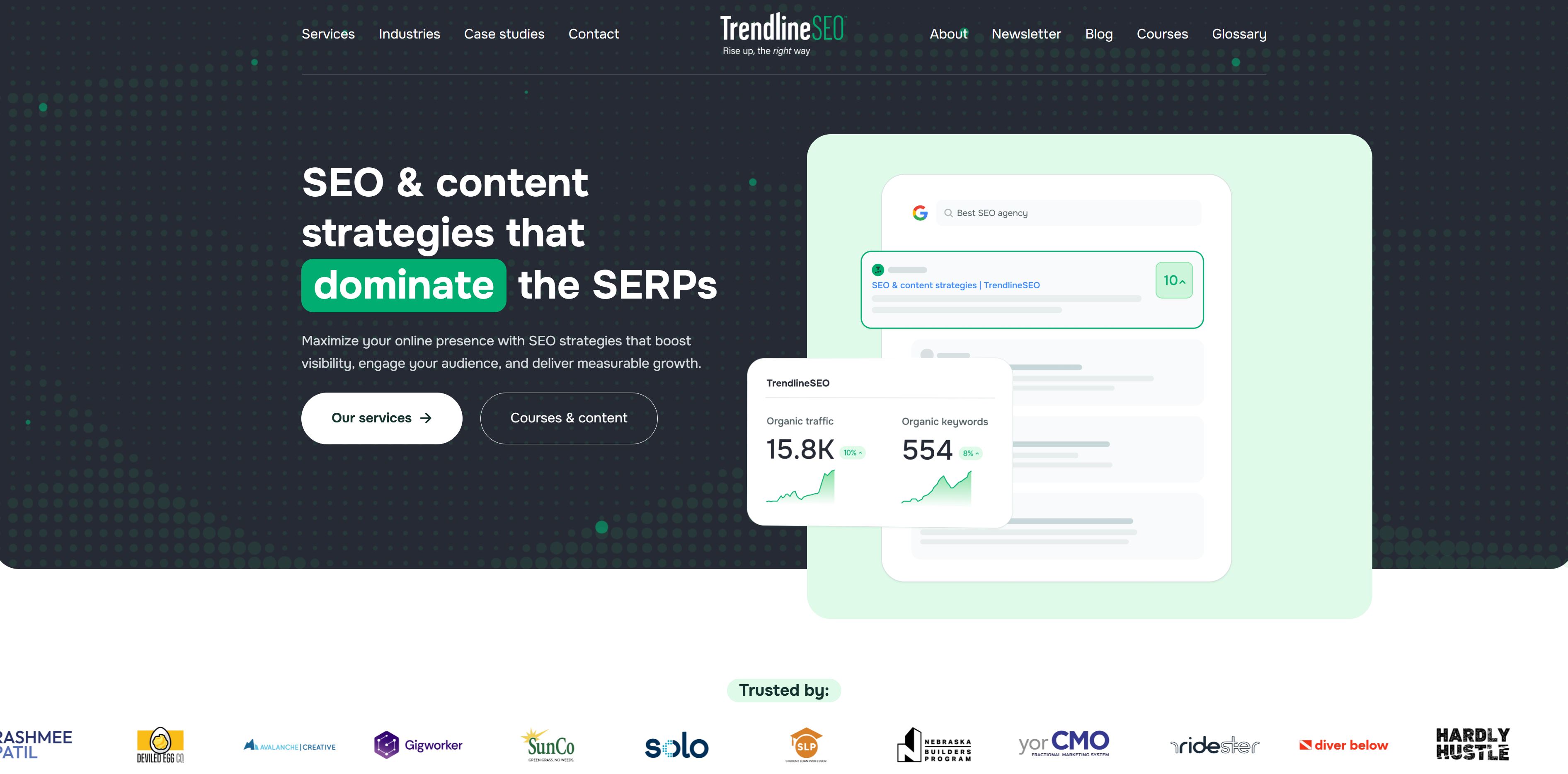
A great example of this is the graphic within the brand story section of our About Us page.
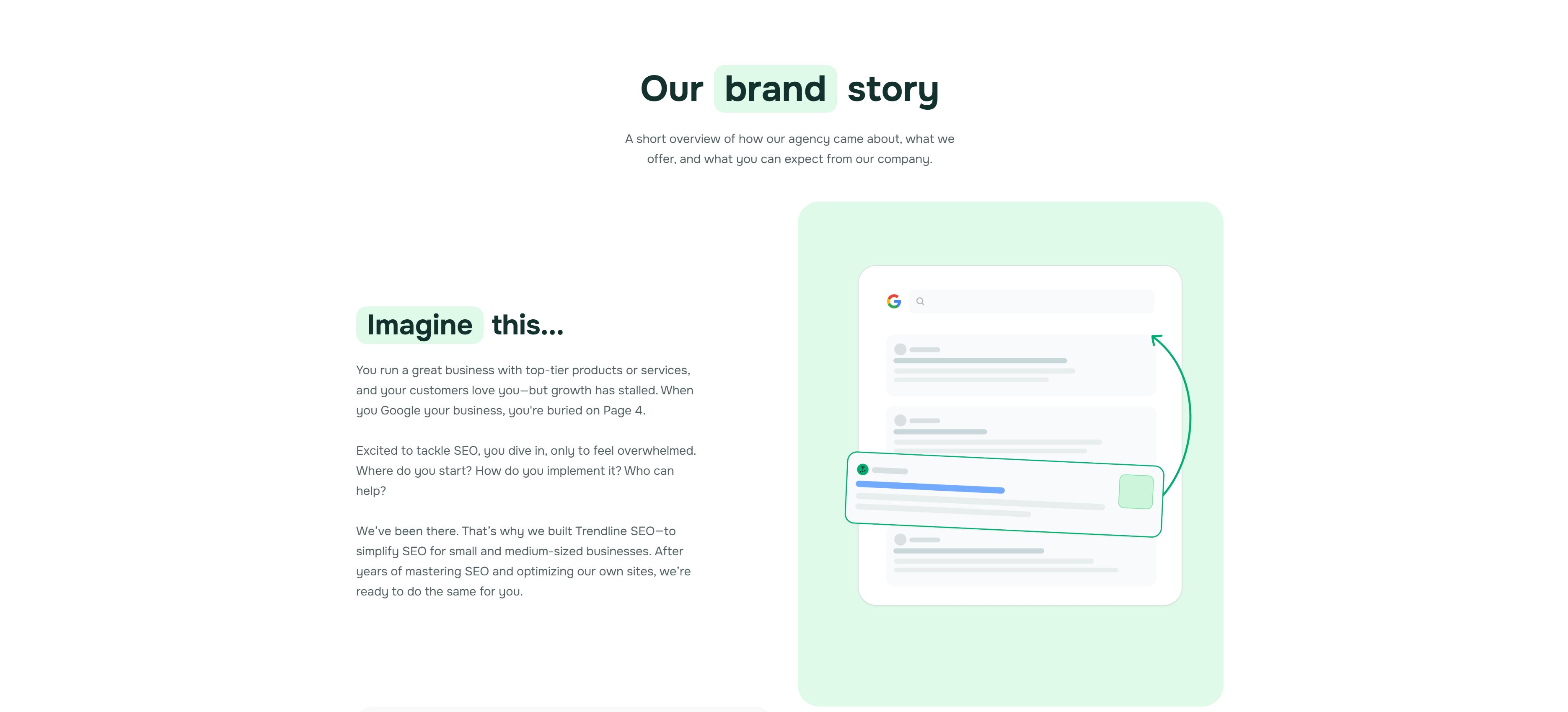
We could have used a boring generic traffic graph, but instead, took the time to design a custom graphic that shows what we do best - moving rankings up in the SERPs.
Little touches like this not only help to set our brand apart from the competition, but also remain memorable in the mind of our clients and those that read our page.
Webflow: Making Development Marketer-Friendly
With our designs finalized, the next step was turning them into a fully functional website.
Early on, we briefly considered starting with a template-based approach to speed things up, but quickly realized that a fully custom build was essential to showcase the unique elements we'd created.
At the same time, we knew that relying too heavily on developers for every small change wasn't an efficient or sustainable approach.
This brought us to an important decision: choosing the right platform.
Our development team primarily uses either Webflow or WordPress, depending on each project's specific demands.
For our agency site, Webflow was the clear choice because it excels at visually rich, interactive designs.
Its intuitive interface and visual CMS enable us to manage content, make design tweaks, and rapidly iterate without getting bogged down by complex code.
The combination of WordPress and GeneratePress still remains a powerful solution for clients who prioritize scalability and manage extensive content libraries.
However, it doesn't easily accommodate intricate designs or rapid customizations. WordPress is excellent at scale but often requires compromises in visual flexibility.
Webflow, on the other hand, thrives precisely where WordPress struggles.
It allows seamless integration of animations, interactions, and custom graphics without sacrificing the ability for non-developers to quickly make updates.
Navigating these platform trade-offs is something we're familiar with, always matching the unique needs of each project with the best solution.
Choosing Webflow for our site paid off in spades and we haven't looked back.
Project results
The website’s modular design system, developed in Figma and translated into Webflow, significantly reduced development timelines.
It took the team about a month to design and build the site but the end result was well worth that work. I couldn't be prouder of the end product.
We ended up with a custom unique asset that stands above the competition in terms of design, structure, and scale.
But from the moment our redesigned website launched, the real success was in its architecture’s scalability.
Our strategic use of page templates and topic clusters meant adding new services, case studies, pages, or entire industry verticals required no disruptive redesign or SEO headaches.
Rather than simply chasing a short timeline or a simplified pre-built approach, we deliberately built a flexible, SEO-driven framework that allowed seamless expansion.
- Services pages describe what we do and rank for transactional keywords.
- Case studies help us showcase our the biggest wins that we're most proud of.
- Industry pages educate niche-specific website owners while also showcasing our expertise.
- Course content allows us to easily sort related content into similar areas which are easy to browse and read.
- Blog posts are a great way for us to share interesting insights related to various categories of digital marketing.
Each new piece of content naturally slotted into place, immediately benefiting from established authority and streamlined navigation.
Our team is now able rapidly iterate or create entirely new pages without extensive developer intervention, enabling the website to evolve effortlessly as our business grows.
For example, when I wanted to create a Hire Brett page to add to my LinkedIn profile, I simply copied the About Us page and then added components to the page to fully build it out.
This flexibility didn’t just streamline internal processes, it became a competitive advantage.
Whether scaling educational content, rolling out new landing pages, or expanding our glossary to attract deeper organic visibility, every new addition reinforced the overall site structure rather than diluting it.
In short, we didn’t just build a static website. We created an SEO-first architecture that scales intuitively, grows efficiently, and adapts easily - an enduring foundation perfectly aligned with our long-term vision.

